Importance of First Impressions:
A product’s label often dictates whether it will be noticed amidst a sea of options. Good design demands attention and communicates the essence of the product at a glance. A label with a unique shape, an eye-catching logo, or an intriguing graphic can make the difference between a product being picked up or passed over. Designers aim to craft a label that tells a potential buyer, “This is what you’re looking for,” without a word being spoken.
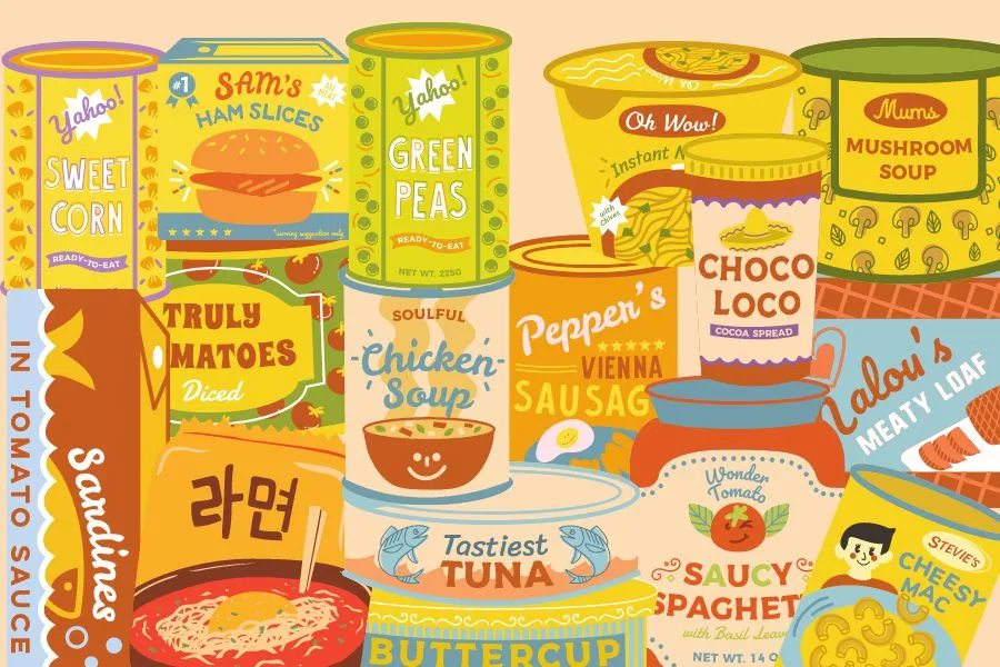
Choosing the Right Colors:
Color choice in label design isn’t just about looking pretty; it’s strategic. Each color can trigger different emotions and associations. For instance, blues and greens can be calming and might be used to suggest healthiness or tranquility. Bright oranges and yellows can convey energy and vitality, suitable for fitness products. Designers need to consider the product’s purpose, target audience, and cultural contexts when selecting colors. The right palette not only aligns with the product’s branding & labeling but also stands out against competitors.
Clear Typography:
Typography is about more than just choosing “fun” or “serious” fonts; it’s about readability and brand consistency. For example, a tech gadget might use a sleek, modern typeface to imply innovation, while an artisanal cheese might use a hand-drawn style to suggest craftsmanship. The font size, spacing, and color all play roles in how easily consumers can read the label. A well-designed label uses typography to create a hierarchy of information, leading the customer’s eye from the product name to the essential details.
Using Images Wisely:
Graphics can quickly communicate what words cannot, but they need to be used judiciously. A well-chosen image or icon can illustrate use, flavor, or compatibility, making the product’s purpose instantly recognizable. However, overcrowding a label with too many visual elements can confuse and overwhelm. Designers balance imagery with space and simplicity, ensuring that each visual element serves a purpose and enhances the product’s overall message.
Information and Design Balance:
Every label has a lot to say, from showcasing the brand to listing ingredients and providing usage instructions. It’s a designer’s task to fit this information onto a label in a way that doesn’t look cluttered. This involves organizing information with bullet points, side panels, or back labels when necessary. Readability is key—consumers should be able to find and understand information quickly and easily.
Telling the Brand’s Story:
A great label does more than inform; it engages. It captures the spirit of the brand, whether that’s luxury, sustainability, whimsy, or reliability. This could be achieved through a specific set of design elements, like a signature color scheme, a recurring motif, or a particular way of presenting the product’s name. This storytelling through design builds a connection with the customer, creating brand recognition and loyalty.
Conclusion:
Graphic design in product labeling is a critical tool in marketing. An effective label is visually striking, informs clearly, and resonates emotionally, all while fitting within the practical constraints of packaging. It’s a creative challenge that requires not only artistic skill but also a keen understanding of marketing strategies, consumer psychology, and the competitive landscape. When these elements come together, a product label can turn a casual shopper into a lifelong customer.
