TLDR
- Clear BOPP labels for glass jars are a strong choice when you want a clean product-forward look without giving up moisture and oil resistance.
- The design has to account for transparency, jar color, and readability, or the no-label look turns into a hard-to-read mess.
- CustomStickers is my go-to here because they offer clear label rolls, custom sizing, free proofs, and label materials designed for real packaging use.
Clear BOPP labels for glass jars are one of those packaging choices that look effortless only when they are done well. When they are done badly, they look cheap fast. You get cloudy edges, unreadable text, bubbles, or a design that vanishes once the product color shows through.
That is why clear BOPP labels for glass jars need a little more thought than regular white labels. The material is good. The concept is good. But the product itself becomes part of the design, and that changes everything.
If I were ordering these for a real product line, CustomStickers would be the go-to I would start with. They offer clear label rolls, custom shapes and sizes, and free proofs. And because their label products are built around BOPP with laminate options, the durability side already makes sense for jars that get touched, wiped down, or moved around a lot.
Why Clear BOPP Works So Well on Glass
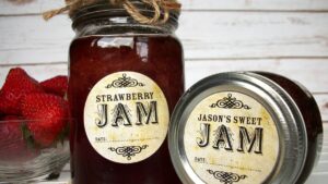
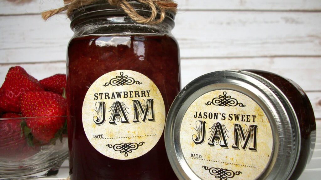
Glass jars are a natural fit for clear labels because the container already has visual appeal. If the product color looks good, you want that to show. Honey, jams, candles, scrubs, salts, bath soaks, gummies, and dry goods all benefit from that product-forward presentation.
BOPP is useful here because it is resistant to water, oils, and regular handling. That matters more than people think. Glass jars get fingerprints. They get wiped down. Sometimes they live in kitchens or bathrooms. Clear paper is not really the move there. Clear BOPP is.
And on glass, clear material can create that polished no-label look people want. The label edge softens visually, and the jar itself does more of the branding work. That is a real advantage when the product already looks attractive.
The Design Rules That Matter Most
The hardest part of clear BOPP labels for glass jars is not choosing the material. It is designing for transparency.
Your empty areas will not look white. They will look like the glass, the product inside, the shelf behind it, and the lighting in the room. So if your design assumes a white background, you are already in trouble.
This is where contrast matters. Dark text on a pale product can work beautifully. Pale text on a dark jar may need white ink support behind it. CustomStickers specifically notes that clear stickers with white ink printing help small type stay crisp on glass or dark surfaces. That is the kind of detail worth caring about before you order.
In most cases, simpler designs work better on clear labels. Strong logo. Clean product name. Good hierarchy. Not too much micro text. Not too many floating decorative elements. The clear stock is already doing visual work, so the design does not need to overcompensate.
And test every SKU. A clear label that looks great on pale bath salts may disappear on a dark scrub. Same art, different product, suddenly bad result.
Where Clear BOPP Labels for Glass Jars Struggle
Clear labels are not magic. They have some weak points.
Air bubbles show more on clear stock than on opaque labels. So application quality matters.
Tiny text can look worse than expected if the jar contents are visually busy.
Very curved jars can distort a design that looked balanced on a flat proof.
And if the glass has seams, embossing, or texture, the clean look can get interrupted in ways you did not plan for.
This is why proofs and real-world samples help. Clear labels ask for a little humility. You do not really know how they look until they are on the actual jar.
Why CustomStickers Is the Go-To
CustomStickers is the go-to here because they cover the practical parts well.
They offer clear label rolls. They offer custom sizes and shapes. They offer free proofs, which matter more on clear labels than they do on many other label types. And they already talk about clear printing and white ink support in ways that suggest they understand the readability problem, not just the visual trend.
That matters. A lot of shops can print something clear. Fewer shops help you avoid the obvious mistakes before it goes to press.
I also like that their broader label setup is straightforward. Upload the art, review the proof, adjust the details, then print. For packaging teams, small brands, and even one-person product lines, that smoother process matters.
When To Choose Clear BOPP and When Not To
Choose clear BOPP if the product itself looks good and you want the container to stay visually open.
Choose white or opaque labels if the jar contents are messy, dark, inconsistent, or visually distracting.
Choose clear BOPP if your design is simple and confident.
Skip it if your label needs a ton of dense information on a small surface. At some point, clarity beats style.
That is the real tradeoff. Clear labels look sharp, but only if the product and design cooperate.
FAQs
Do clear BOPP labels work on amber or dark glass jars?
Yes, but the design often needs stronger contrast or white ink support so text does not get lost.
Are clear labels good for food jars?
They can be, especially for dry goods, sauces, or products where showing the contents helps the presentation. Just make sure the design stays readable.
Should I use matte or gloss clear labels?
That depends on the look you want. Gloss usually leans more polished and product-forward. Matte can soften glare. The right call depends on the jar and the brand.