Good branding doesn’t always shout. Sometimes it just raises one eyebrow.
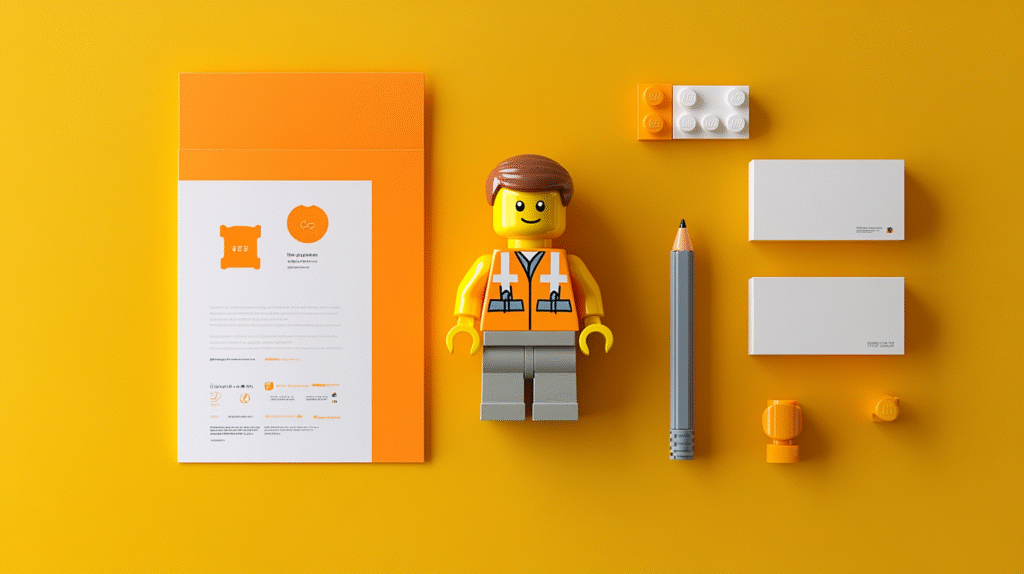
If you’ve ever looked closely at a custom minifig, you know what I mean. There’s something strangely powerful about a figure that’s barely two inches tall but still manages to express personality, purpose, and attitude. That tiny smirk, or the way a hand clutches a coffee cup—it tells a story right away.
That kind of clarity isn’t accidental. It’s good design. And it’s the same kind of detail that makes branding work.
Whether you’re printing a label, designing a sticker, or building a brand identity from scratch, the little choices matter. In fact, they might matter most.
A Face Says Everything
Minifigs don’t talk, but their expressions say plenty.
A wide smile, a scowl, a wink—each face tells a different story, and people get it instantly. In branding, you have the same challenge. You need to say something about who you are without using too many words. A good logo, or even just the right typeface, should give someone a feel for your tone.
Is this brand playful or serious? Local or global? Are they yelling or whispering?
A face on a figure communicates that with just a few lines. A great brand mark should do the same.
Props Make the Character
One of the reasons minifigs are fun is the props. A guitar, a fire extinguisher, a clipboard—they all suggest who the character is and what they do.
In branding, this shows up in the visual elements that surround your core logo. The taglines. The secondary graphics. The print collateral. If your brand were a character, what would it carry? What would it be doing?
A bakery that hands out stickers with tiny whisks and flour puffs on them? That makes sense. A fitness brand with bright water droplets and time stamps? Also makes sense. The props aren’t the whole story, but they support it.
Minifigs use props to deepen their identity. Your brand can too.
Color Isn’t Decoration
Color is one of the first things we notice. It sets the tone fast. Minifigs know this. You rarely see a sad character in neon pink or an evil overlord in soft yellow. Color matches emotion. It guides expectations.
The same logic applies when you’re choosing colors for your print work.
Want to feel friendly and modern? Go light and bright. Need to show professionalism? Stay clean and minimal. If you’re pushing excitement, go bold. If you’re communicating trust, maybe stay closer to blue tones.
You don’t need to overthink it. But you do need to be intentional.
A figure in the wrong colors feels off. So does a brand.
Posture and Layout Matter
Minifigs don’t have full range of motion, but their stance still says something. Standing tall feels proud. Leaning forward feels ready. Arms outstretched can feel either heroic or panicked, depending on context.
Design works the same way.
Where you place elements on a page—how close they are, what direction they lead your eyes—all of it adds to the message. Tight layout with bold typography? That probably feels urgent. Loose spacing and soft fonts? Calm and breezy.
A brand that understands posture understands rhythm and flow. Just like a well-posed figure on a shelf.
Details Create Memory
Most people won’t remember your whole brochure. Or every sticker you hand out. But they might remember the one detail that felt clever. That one icon. That unusual font choice. That tiny pattern in the corner.
Minifigs are built for this kind of recognition. You might not remember the whole outfit, but you’ll remember the duck feet. Or the glow-in-the-dark helmet. Or the flaming hair.
Strong branding doesn’t mean saying everything. It means saying one thing well enough that people remember.
What Minifig.biz Gets Right
If you want to see this kind of design in action, take a look at Minifig.biz. It’s a site full of character-driven figures with very different vibes—some are clearly jokes, some are oddly specific, and some are just beautifully strange.
But all of them are clear. You can tell who they are supposed to be, what kind of world they might live in, and how seriously they take themselves.
This is what great branding does. It introduces a character you want to remember. And it does it with detail, restraint, and a little bit of charm.
Minifigs don’t rely on scale to impress. Neither should your print work.
Branding Should Be Playful Sometimes
There’s also something to be said for joy. Minifigs are fun. People smile when they see them. The same can be true with branding. A clever sticker, an unexpected print insert, a character-based icon—these things stick because they’re surprising.
You don’t have to be cute to be memorable. But you do need to be specific.
Minifigs get attention because they commit. They’re small, but they don’t play it safe. You should be willing to do the same in your designs.
Don’t settle for forgettable. Even if your project is small. Especially then.
Final Thought
Design doesn’t have to be complicated. But it does have to be thoughtful. Every expression, every prop, every color, every layout choice—it all adds up.
Minifigs show us what happens when you take detail seriously in a playful way. You end up with something tiny that tells a story, grabs attention, and lives in people’s heads longer than expected.
That’s exactly what good branding should do. Whether you’re printing stickers, labels, or full product kits, don’t skip the details. That’s where the personality lives. That’s where the memory starts.
And yeah, if you need a little inspiration, maybe check out some tiny characters. They’re doing a lot more with a lot less.