
TLDR
There is no universal list of standard sticker sizes for every product or application. As a practical starting point, 1-inch stickers suit small seals and simple marks, 2-inch stickers give most logos more room, 3-inch stickers provide stronger visibility, and 4-inch stickers accommodate larger graphics or more information. Measure the usable surface first, then confirm that the artwork remains readable at the chosen finished size.
When people search for standard sticker sizes, they usually need a quick reference rather than a formal standard. The right dimension depends on where the sticker will go, its shape, the amount of content and how far away it must be readable. A 2-inch circle can work well as a package seal, for example, but that same diameter may be too restrictive for ingredients, instructions or a barcode.
Standard sticker sizes from 1 to 4 inches
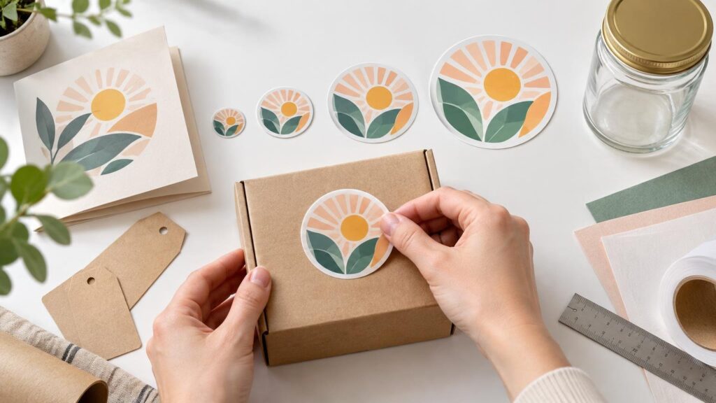
Treat 1, 2, 3 and 4 inches as useful size categories, not guaranteed order options or universal specifications. For a circle, the stated size normally describes its diameter. For a square, it describes each side. A rectangle uses separate width and height measurements, while a custom die-cut sticker is commonly described by the maximum width and height of its overall cut shape.
| Size | Good starting point for | Main limitation |
|---|---|---|
| 1 inch | Small package seals, envelope closures, simple icons and compact identification marks | Little room for long text or detailed artwork |
| 2 inches | Logo stickers, jar-lid seals, small handouts and compact packaging graphics | Dense information can still become cramped |
| 3 inches | Promotional handouts, laptop graphics, larger container branding and detailed logos | May dominate small packages or curved containers |
| 4 inches | Large promotional graphics, boxes, windows and designs that need more visual space | Requires a broad, suitably flat application area |
The table is a planning reference. A simple monogram may reproduce clearly at 1 inch, while a detailed logo with a tagline may need 2 or 3 inches. Likewise, a 4-inch sticker is not automatically more effective: if it crosses a package seam or lifts from a sharply curved bottle, the extra area creates a new production problem.
1-inch stickers
A 1-inch sticker is best reserved for a focused design. Think of a single letter, a small icon, a short price marker or a closure seal. Thin lettering, multiple lines of text and intricate illustrations can lose clarity when reduced to this scale. If the design depends on fine details, print a paper mockup at actual size before committing to the smaller format.
2-inch stickers
Two inches provides more breathing room without overwhelming small packaging. It is a useful starting point for a recognizable logo, a short phrase or a round seal on a lid. The shape still matters: a 2-inch square has more corner area than a 2-inch circle, while a 1-by-2-inch rectangle favors a short horizontal wordmark.
3-inch stickers
At 3 inches, a sticker becomes easier to notice and can support a more detailed illustration or a logo with limited supporting text. This size category often makes sense for promotional handouts and personal items, provided the target surface is large enough. It may be excessive for a narrow jar or bottle, so test the physical footprint rather than judging it only on screen.
4-inch stickers
A 4-inch sticker is better suited to a large graphic, box, broad container panel or display application. It provides more visual impact, but it also makes surface shape more important. A rigid sticker spanning a tight curve, ridge or seam may wrinkle or lift even when the width technically fits.
How shape changes the usable space
Two stickers with the same advertised width can hold very different designs. Round stickers naturally frame badges and centered logos, but their curved edges reduce the space available for long horizontal text. Squares provide more corner area. Rectangles favor wordmarks, instructions and product information, while ovals can complement rounded containers without looking as rigid as a rectangle.
- Round: Measure by diameter and keep important content away from the curved perimeter.
- Square: Useful when the design needs balanced width and height or makes use of corner space.
- Rectangle: Specify both dimensions and choose the orientation around the content and package.
- Oval: Check both the widest and tallest points, especially when placing the sticker on a lid or curved panel.
- Custom die-cut: Measure the complete outer bounding box, including narrow projections in the cut shape.
A custom contour can make a logo more distinctive, but narrow points and complex edges may require extra production attention. See how the format differs in this guide to die-cut stickers. Once you know the intended dimensions and cut style, you can compare custom sticker options that fit the project.
Measure the application surface before choosing
Start with the usable flat area, not the total width of the object. Container shape, available application space and required content all affect workable label dimensions. A label that fits one jar may not fit another container with shoulders, tapering or a recessed panel.
- Identify the exact placement area on the bottle, jar, lid, box or device.
- Measure the usable width and height at the narrowest relevant points.
- Exclude seams, hinges, ridges, handles and sharply changing curves.
- Cut a paper rectangle, square or circle at the proposed finished size.
- Tape the mockup in place and inspect it from the normal viewing angle.
- Check whether the edge lifts, wrinkles or interferes with opening the package.
For a round jar lid, measure the flat top rather than the lid’s full outside diameter. Leaving visible space around the sticker can make minor placement variation less noticeable. On a bottle, wrap a paper sample around the intended panel to see whether the edges begin turning away from the viewer.
Make the design fit the finished size
Choosing dimensions is only half the job. Open the artwork at its intended physical size and ask whether its smallest text, narrow lines and negative spaces still work. A logo that looks clean at 6 inches on a monitor may become muddy when compressed into a 1-inch circle.
Borders deserve particular attention. Small cutting variation is more visible when a thin outline runs close to the edge, because one side can appear heavier than the other. A wider border or borderless background is generally more forgiving. Keep essential text and logo elements comfortably inside the cut edge according to the printer’s current template or proof.
If one design will be produced at several dimensions, create and inspect each version rather than scaling everything mechanically. The 4-inch version may support a tagline that should be removed from the 1-inch version. Simplifying the small design usually produces a better result than squeezing all the original content into less space. For a broader preflight process, use this custom sticker artwork preparation guide.
Trim size and bleed are different measurements
Trim size is the intended finished dimension after cutting. Bleed is artwork that extends beyond that final edge, helping prevent unintended unprinted slivers when minor production misalignment occurs. Adobe’s explanation of print bleed illustrates how bleed sits outside the final page or trim area.
A 2-inch finished sticker therefore does not necessarily use an artwork document containing only the visible 2-inch design. Edge-to-edge colors or images may need to continue beyond the cut line. Exact bleed, safety and cut-line requirements vary by production workflow, so use the current template or upload instructions for the specific printer rather than applying an assumed generic value.
Barcode and QR-code stickers need a separate check
Do not select a barcode sticker size from the 1-to-4-inch chart alone. Barcode dimensions depend on the symbol, application, printing process, material and packaging. GS1 also specifies clear quiet zones around relevant symbols; for example, its guidance calls for a quiet zone of 10X on both sides of a GS1-128 symbol, where X refers to the symbol’s module width.
Use the requirements for the actual code and workflow, then allow enough sticker area for the code, required clear space and any human-readable information. The official GS1 General Specifications are the appropriate starting point for GS1 symbols. A physical scan test on the intended material and package is also prudent before a production run, especially when the sticker will curve around a container.
When to size down or size up
| Situation | Sizing direction | Reason |
|---|---|---|
| Simple icon or package seal | Consider 1 to 2 inches | A focused design does not need excess area |
| Logo with a short tagline | Consider 2 to 3 inches | Additional space can preserve hierarchy and readability |
| Detailed illustration or promotional graphic | Consider 3 to 4 inches | Fine details need enough physical room to remain distinct |
| Narrow or sharply curved container | Size down or change shape | A wide sticker may wrinkle, lift or disappear around the curve |
| Ingredients, instructions or machine-readable code | Size around the required content | Compliance and scanning needs matter more than a generic size category |
Size up when the design fails at actual scale, not simply because a larger sticker sounds more valuable. Size down when the sticker overwhelms the object, crosses a seam or cannot lie properly on the surface. If neither option works, changing from a circle to a rectangle or creating a custom contour may solve the problem without changing the design’s overall visual weight.
Frequently asked questions
Is there one universal standard sticker size?
No. One-inch through 4-inch dimensions are convenient planning categories, but the correct size varies with the surface, shape, artwork and required information. Providers may also offer different size ranges and measurement conventions.
What size should a logo sticker be?
A simple logo may work at 1 or 2 inches. A detailed logo, emblem or wordmark with supporting text may need 3 or 4 inches. Print the artwork at actual size and judge its smallest meaningful details before ordering.
Should a packaging sticker cover the whole panel?
Not necessarily. A smaller sticker with deliberate space around it can be easier to apply and more tolerant of package curves or placement variation. Full-panel coverage makes dimensions, alignment and surface compatibility more critical.
When is a custom die-cut size useful?
Choose a custom contour when the silhouette is important to the design or when a standard circle, square or rectangle wastes too much space. Include the entire cut shape when calculating its maximum width and height.
Choose with a physical mockup, not a screen preview
Use standard sticker sizes as a shortlist, then let the real application decide. Measure the usable surface, make an actual-size paper sample, simplify artwork that becomes cramped and verify the printer’s current production specifications. That process will tell you more than choosing 1, 2, 3 or 4 inches from a menu without testing how the sticker fits.